Maia Muniz Moreno - 2021
How Mapping Can Help Us Understand Social Injustice
In light of recent events, social inequality and how cities are planned have been in the public eye. Are architects and designers working towards fair, resilient, and sustainable cities? Or, are we contributing to an environment that perpetuates deep social and economic disparities?
If we look at how architecture and design schools form their students, we too often find designers that are trained to serve their own egos as opposed to serving the community.
Geographic Information System (GIS), in addition to all of the available data and innovative tools used to visualize it, make unequal opportunities and discrimination more and more evident. Mapping, when used correctly, can be very helpful to identify problems in an urban system.
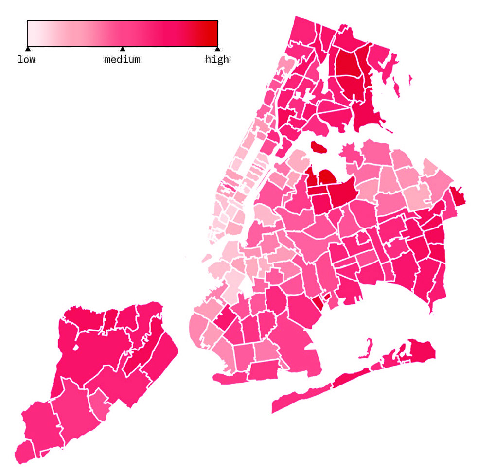
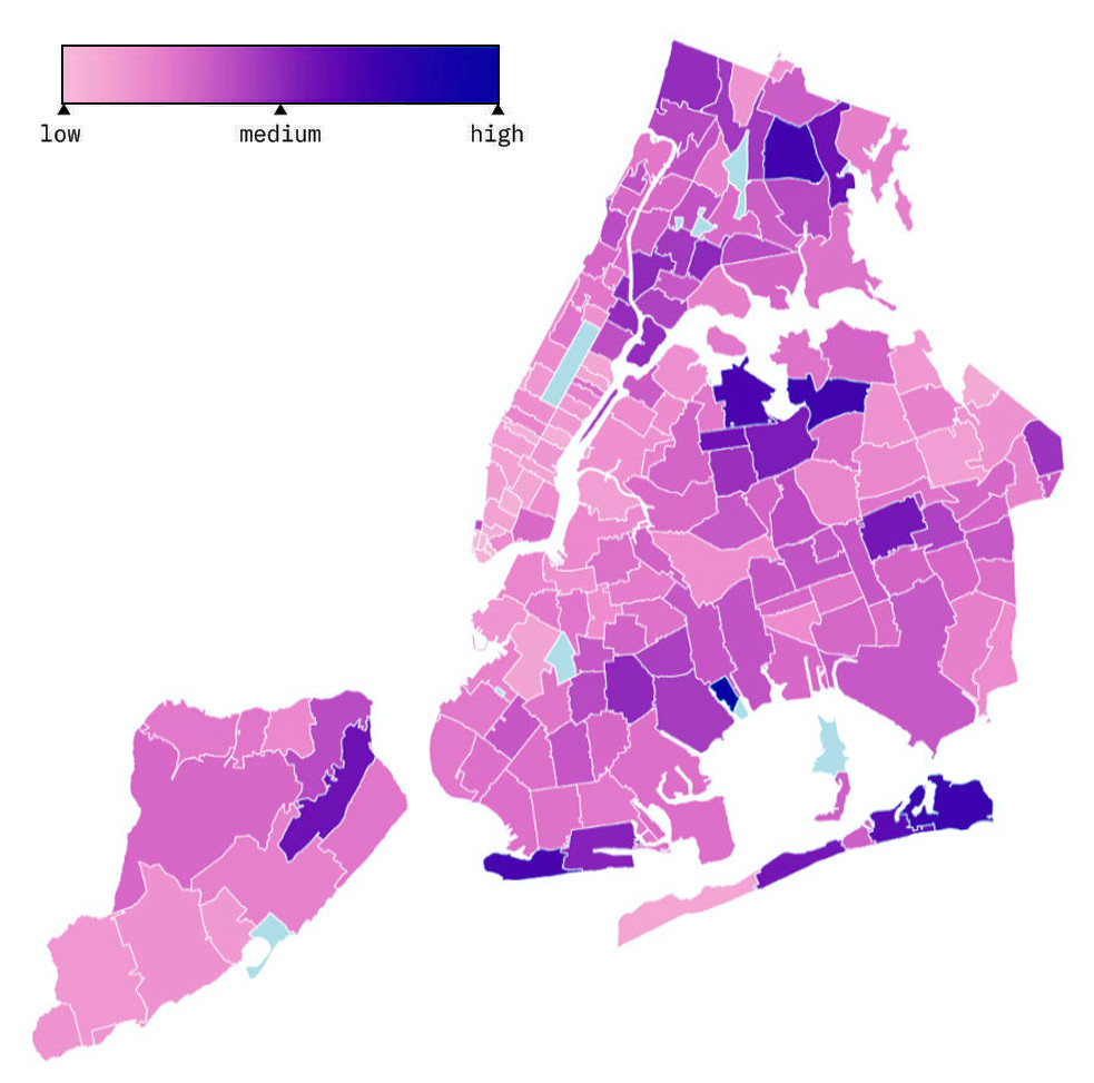
When the COVID-19 pandemic began, there was a lot of speculation regarding its transmission. One common villain to blame was density. However, acquired data disproved that theory very quickly. These two maps reveal how density and COVID-19 cases relate in different parts of the city.
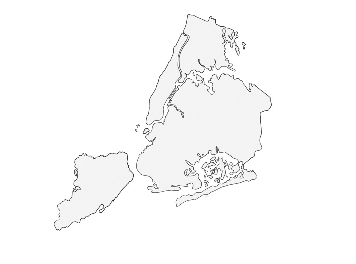
POPULATION DENSITY
EST. % OF POPULATION WITH CONFIRMED COVID-19
Although high density clearly contributes to the spread of the virus, very densely populated cities like Taipei, Tokyo, or Seoul had lower outbreaks than New York City. In contrast, we witnessed regions in Italy with lower population densities having equal or even higher rates of infection than New York. This proves there are other factors at play, and that each case has to be analyzed very closely and independently from one another before being able to compare them.
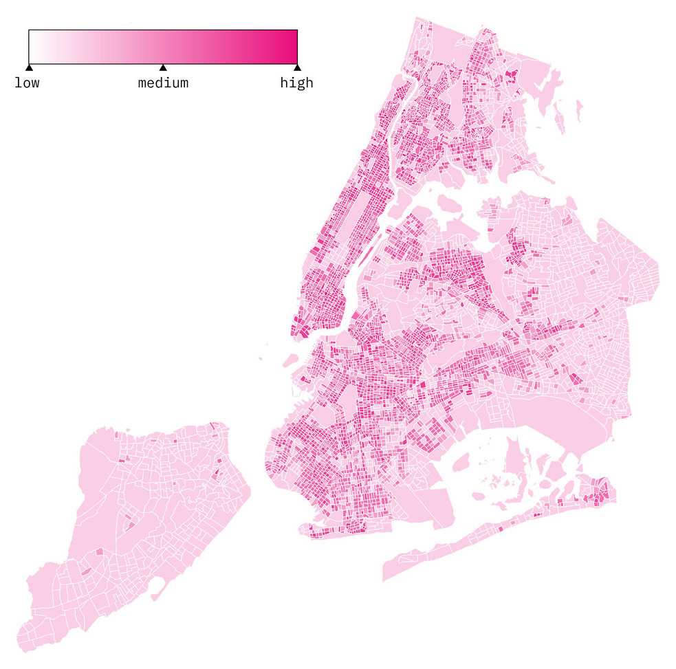
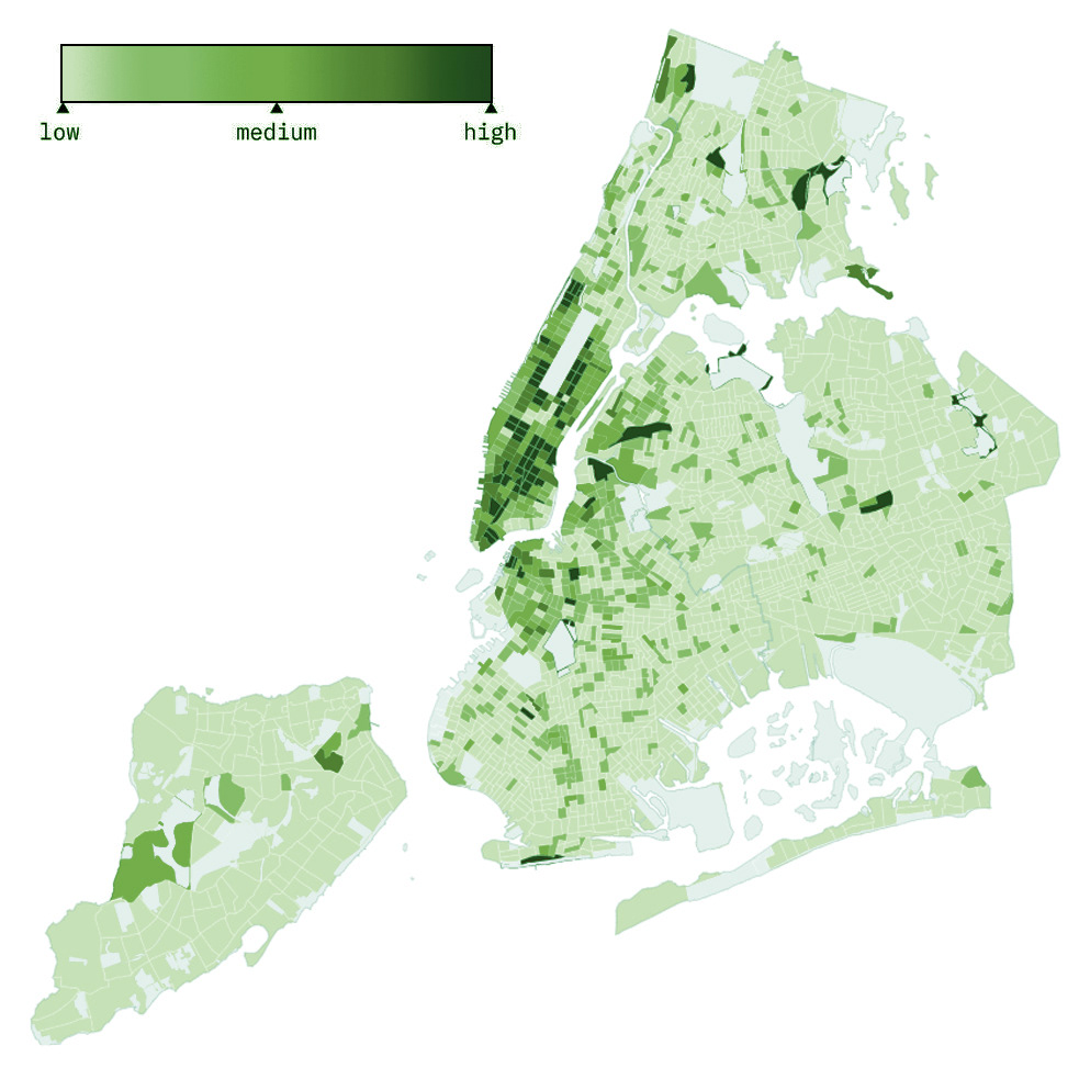
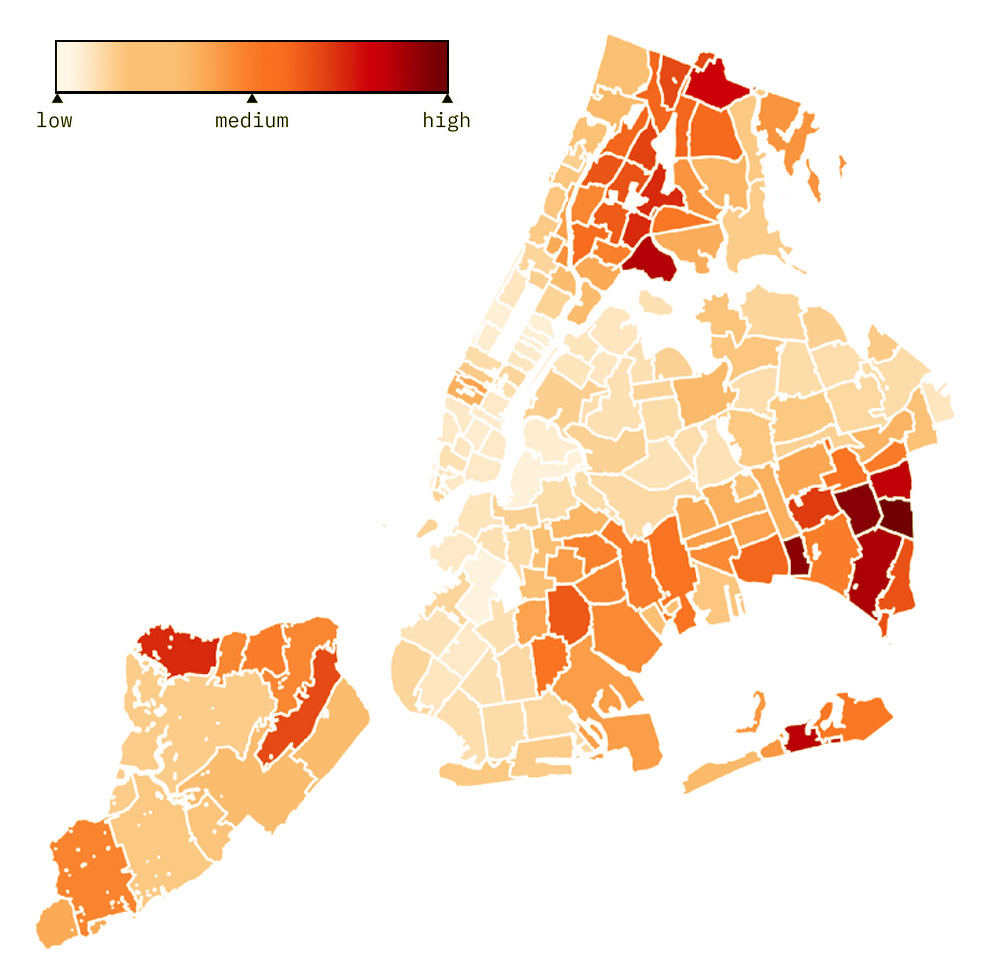
One of the many aspects contributing to our social imbalance is the fact that crowded cities are sometimes linked to lack of hygiene and open spaces. While in some places this may be true, urban centers provide the majority of healthcare, connectivity, greater access to supplies, and quick reaction during emergencies. The problem is that not all residents are being protected equally. This was exposed when the numbers of deaths from COVID-19 by zip code was released. It’s readily apparent how the most affected areas coincide with some of the most vulnerable parts of the city.
COVID-19 DEATH RATE PER 100K
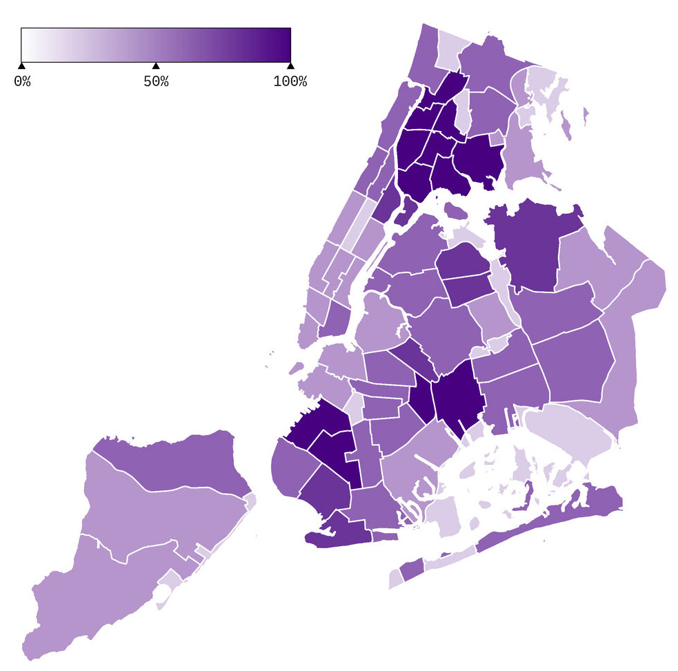
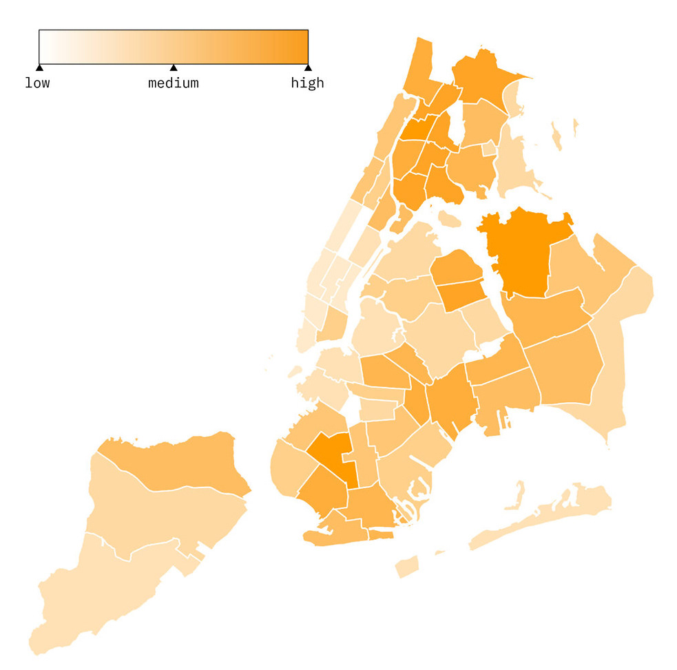
% OF PEOPLE UNDER NYC POVERTY LINE
Low income neighborhoods suffered the highest death rates during this pandemic. People in these areas are less likely to have jobs they can do from home and are most likely sharing housing. This limits their capacity to social distance and stay-at-home. Residents of low income neighborhoods also lack access to quality healthcare which leads to underlying medical conditions and weakened immune systems. Overlaying the maps demonstrates how this crisis didn’t hit all New Yorkers the same way, as well as the racial separations throughout the city.
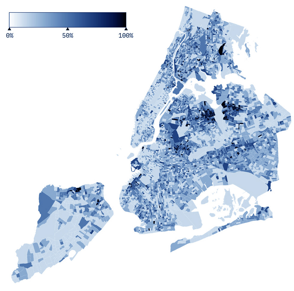
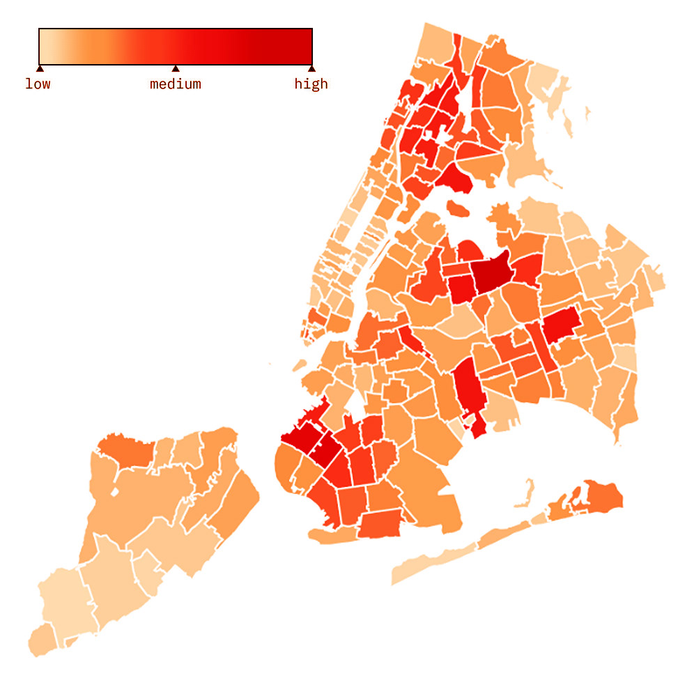
POPULATION WITHOUT HEALTH INSURANCE
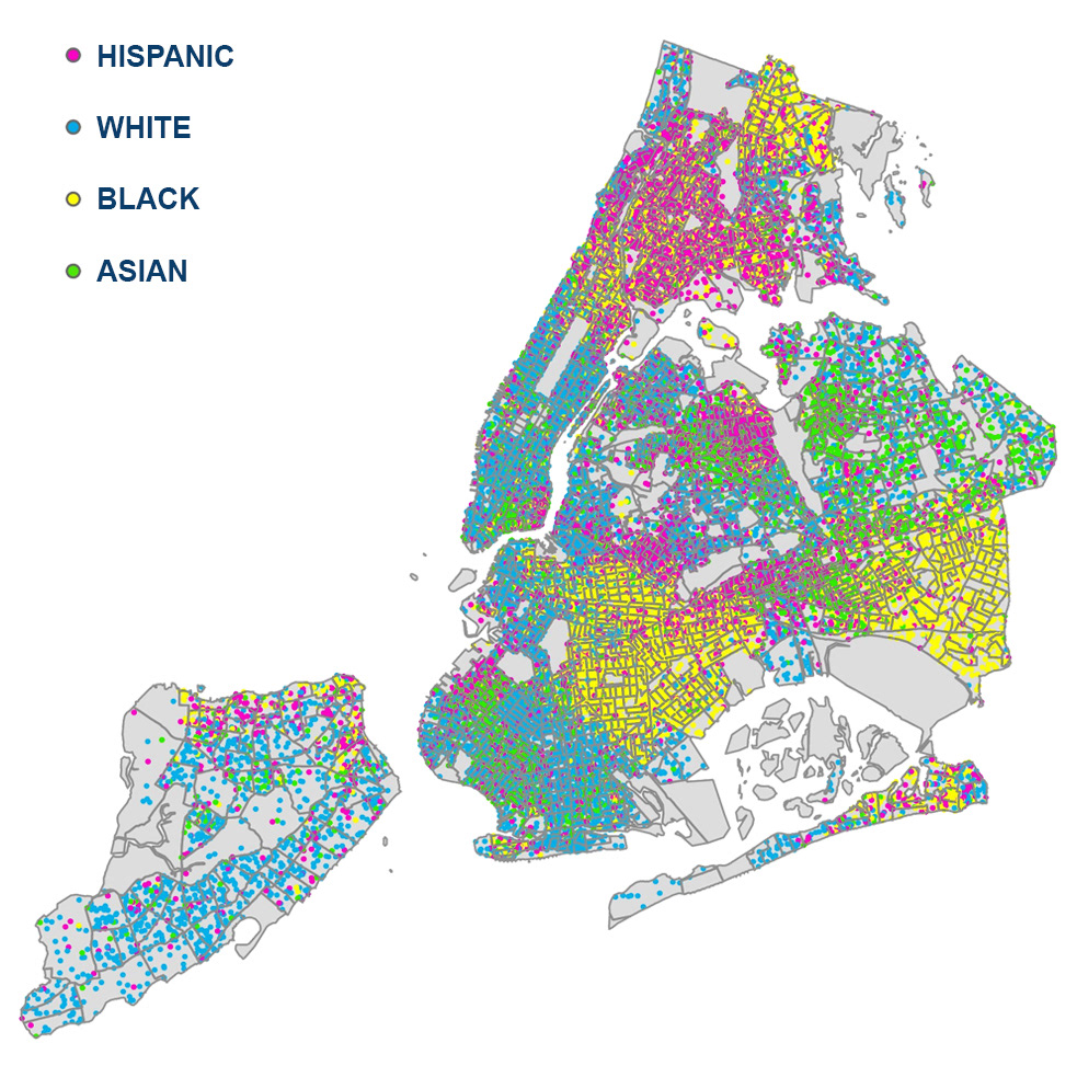
DENSITY BY ETHNICITY_1 DOT = 300 PEOPLE
It’s in moments like this that our social practices, institutional healthcare systems, and social safety nets are really impacted, for better or worse. The zip code in which a person was born should not define their future and limit their access to basic needs such as healthcare. For example, data indicates that the life expectancy of a resident of the Upper East Side as opposed to a resident of East Harlem can vary as much as 10 years, the latter having a shorter life expectancy. However, these neighborhoods are next to each other!
In May 2020, the New York Times published a map based on smartphone location data representing New Yorkers who fled the city. The map shows how the wealthiest neighborhoods emptied between March and May — people with higher incomes and the means to leave the city did so. While there is substantial evidence to support this, and I think the compiled data is very useful, the way in which it is represented in the map is not clear, and reality may or may not be fairly illustrated. Density plays an important role here again, and since we may have more data from areas with greater density, percentages have to be measured on each neighborhood separately so density doesn’t distort the image.
The same problem happened when COVID-19 positive cases were compared between areas with higher and lower testing rates. An area with higher testing will most likely have more positive cases than an area in which testing is very limited. Therefore, it is very important to carefully choose the information we use and the correct way to visualize it.
POPULATION DECREASE IN NEW YORK CITY MARCH 2 TO MAY 1
The lack of affordable housing is one more element driving social inequality.
These maps illustrate (left to right) the percentage of rent from the total household income; the darker the color the higher the rent burden, which contributes to more crowded housing units, more than one person per room (higher virus transmission), and in many cases leads to eviction and homelessness.
RENT BURDEN
CROWDING
EVICTION
Today, nearly one in every 125 New Yorkers is homeless and numbers are expected to rise. Usually, the majority (95%) remains unseen, sleeping in shelters. However, during COVID-19 the homeless have been forced to escape crowded shelters to avoid infection. With so many coffee shops, public restrooms, and rehab centers closed, it has been very difficult to find a bathroom, a place to shower, or even to get a meal since a big part of the food served in shelters come from restaurant donations. While every crisis is hard for everyone, for some it could mean losing their homes or not having food on their plates. This graphic below depicts how homelessness rose after every economic crisis.
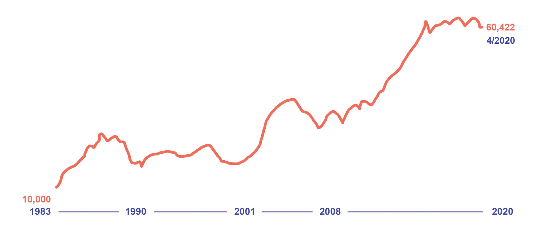
NUMBER OF HOMELESS PEOPLE SLEEPING IN NYC SHELTERS EACH NIGHT
Examples of data analysis have endless applications, but it’s imperative to remember that behind every single number there is a real person with a real struggle. No matter how big or small our influence is, every action is significant, if only for one person. In the process of developing a more equitable urban environment, the first step is to recognize the flaws and how, and who they affect.
Peter Drucker instated the concept that you can’t improve what you can’t measure.
Only then we will be able to make informed decisions, plan, implement, and track progress. This is the only way to successfully begin to transform our context, and make real impact in shaping a city with equal opportunities for all.